"Yes She Can" Campaign: Bringing Playfulness to Serious Subjects
LEAD DESIGNER | CLIENT: BOOZ ALLEN HAMILTION | WORKFORCE EMPOWERMENT INITIATIVE
How might we make government messaging about women's empowerment feel bold, inspiring, and personally relevant rather than institutional and forgettable?
Government design typically follows conservative visual standards that fail to capture attention or inspire action. The challenge was creating a campaign that would break through typical government communications while maintaining accessibility and appealing to diverse women across different industries.
-
I analyzed existing government communications and identified key opportunities to differentiate our approach. Rather than following traditional government design playbooks, I developed a visual strategy that celebrates boldness and determination - the exact qualities we wanted to inspire in our audience. The approach focused on question-driven headlines that invite personal reflection, transforming viewers from passive observers to active participants in their own empowerment story.
-
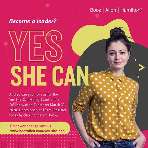
I created a complete visual system spanning poster campaigns, social media graphics, Instagram Stories, and scalable templates for various government departments. The campaign centered on "YES" as the dominant typographic element, sized larger than other text to immediately communicate affirmation and positivity. Supporting elements included morphing circles representing evolution and growth, "trailblazer colors" designed to stop scrollers and catch attention, and authentic photography of real women in professional settings paired with empowering questions like "Lead where others have followed?" and "Change the world?"
-
The typography hierarchy was designed to build confidence, with "YES" taking center stage and leading viewers into "She Can" to create a powerful declaration. I developed a tri-color scheme with bright, energetic colors that pop against any background while maintaining accessibility requirements. The visual metaphor of morphing circles represented the ever-changing nature of women's advancement in the workforce, while question-driven headlines invited personal reflection rather than passive consumption. Additionally, I created animated Instagram Stories using Keynote for rapid prototyping, demonstrating resourcefulness in creating motion graphics with available tools.
-
The campaign successfully challenged the assumption that government communications must be visually conservative, creating a template for how agencies can communicate serious topics with energy and optimism. The bold visual approach was designed to stop scrollers on social media feeds, create shareable moments that extend reach organically, and inspire personal connection rather than passive consumption. I delivered a complete cross-platform system that government teams could implement across multiple touchpoints without losing visual impact or message clarity.
-
This project reinforced that serious subjects don't require serious visuals - joy and empowerment can be more persuasive than traditional authority. Working within government constraints taught me that accessibility requirements can enhance rather than limit creativity when approached strategically, and that approval processes require clear rationale rooted in audience needs. The experience demonstrated how typography hierarchy can create emotional journey, color choices directly influence perception, and flexible systems empower teams by increasing campaign adoption across departments.